Back to blog

August 7, 2026

E-commerce UX: the new way to make sure sales never stop

Here's everything you need to know if you're not sure about investing in your business's website. And we're bringing you the pages that will inspire what your user experience should look like.

We know your product is incredible — but how do you get that across through a screen or a phone? Even more so when you're selling a snack, a drink, or a service. If the page has no design and no experience, it sadly doesn't sell anymore.

That's where e-commerce UX comes in: designing efficient, attractive interfaces that create a memorable experience, so the customer spends more time on the site, fills their cart, and recommends the brand.

The e-commerce UX essentials

  • Operational simplicity.
  • Design that complements the product or service, making it stand out.
  • Information security.
  • Logic in the page's navigation.
  • Catalogs and menus that are easy to understand and browse.
  • Product photography combined with UGC or testimonials.
  • Simple checkout pages that show progress.

One of the most common mistakes in e-commerce is dumping everything on the home page. Nobody likes walking into a place and finding it all cluttered, or being ambushed by an endless list of options they never asked for.

Below is our pick of pages with flawless UX — and what we like about each one.

Nothing Tech

mx.nothing.tech

It hooks you from the very first screen with elements you don't expect from tech.
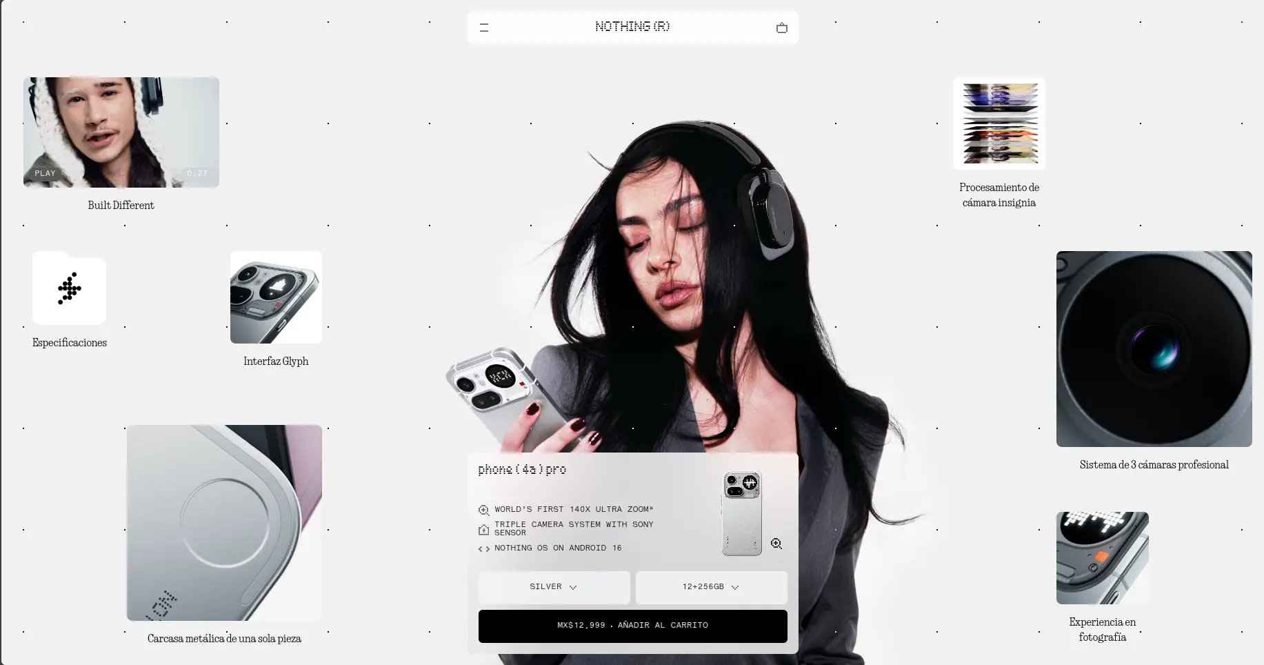
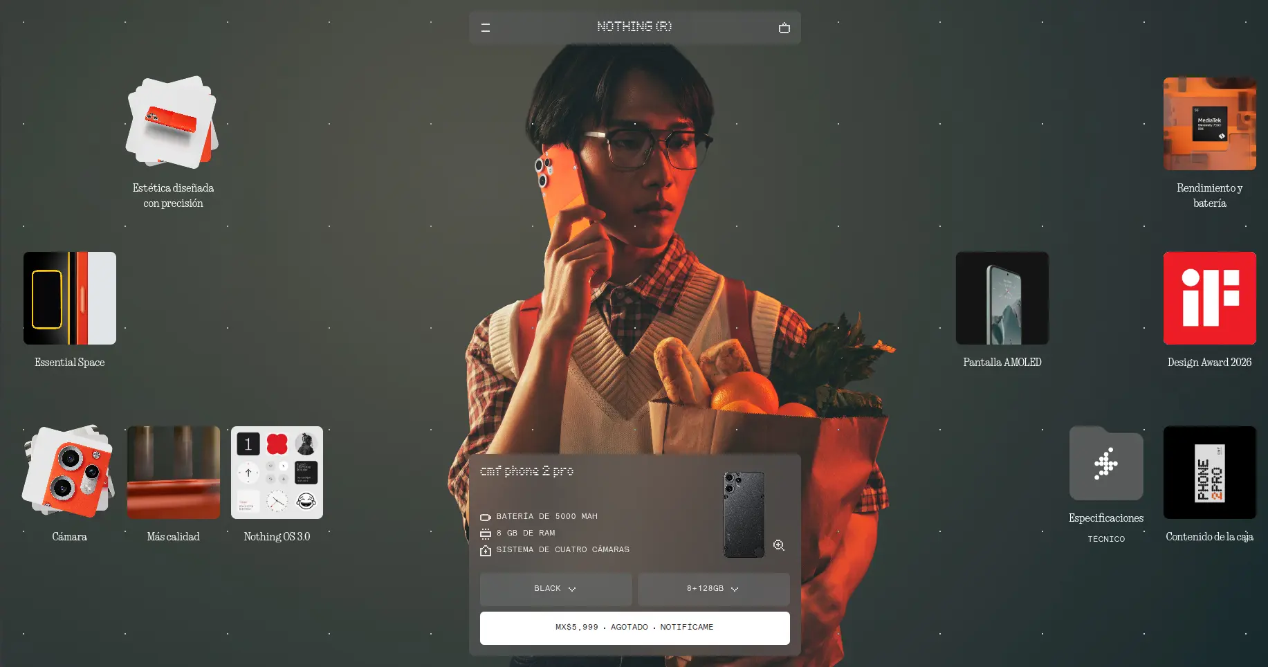
Nothing Phone (3a) Pro product page: the model at the center, video and detail cards around her, and a card with the price and add-to-cart button.CMF Phone 2 Pro page with the same grid of cards — camera, battery, awards — over a full-screen photograph.
Models, videos, animations, short descriptions, and a big buy button in plain sight.

It already has your attention.

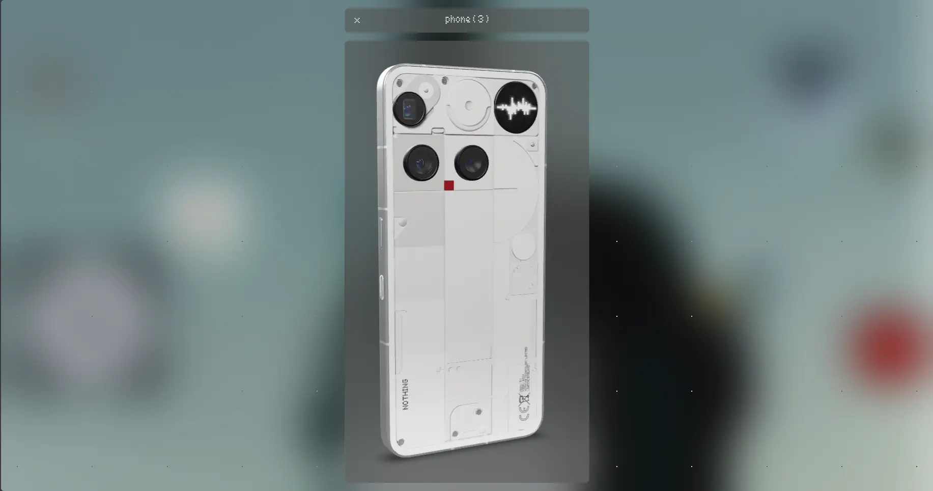
3D viewer of the Nothing Phone (3) rotating over the blurred page background.
Videos, 3D animations, and short copy to learn what the product does.

Easy on the eye.

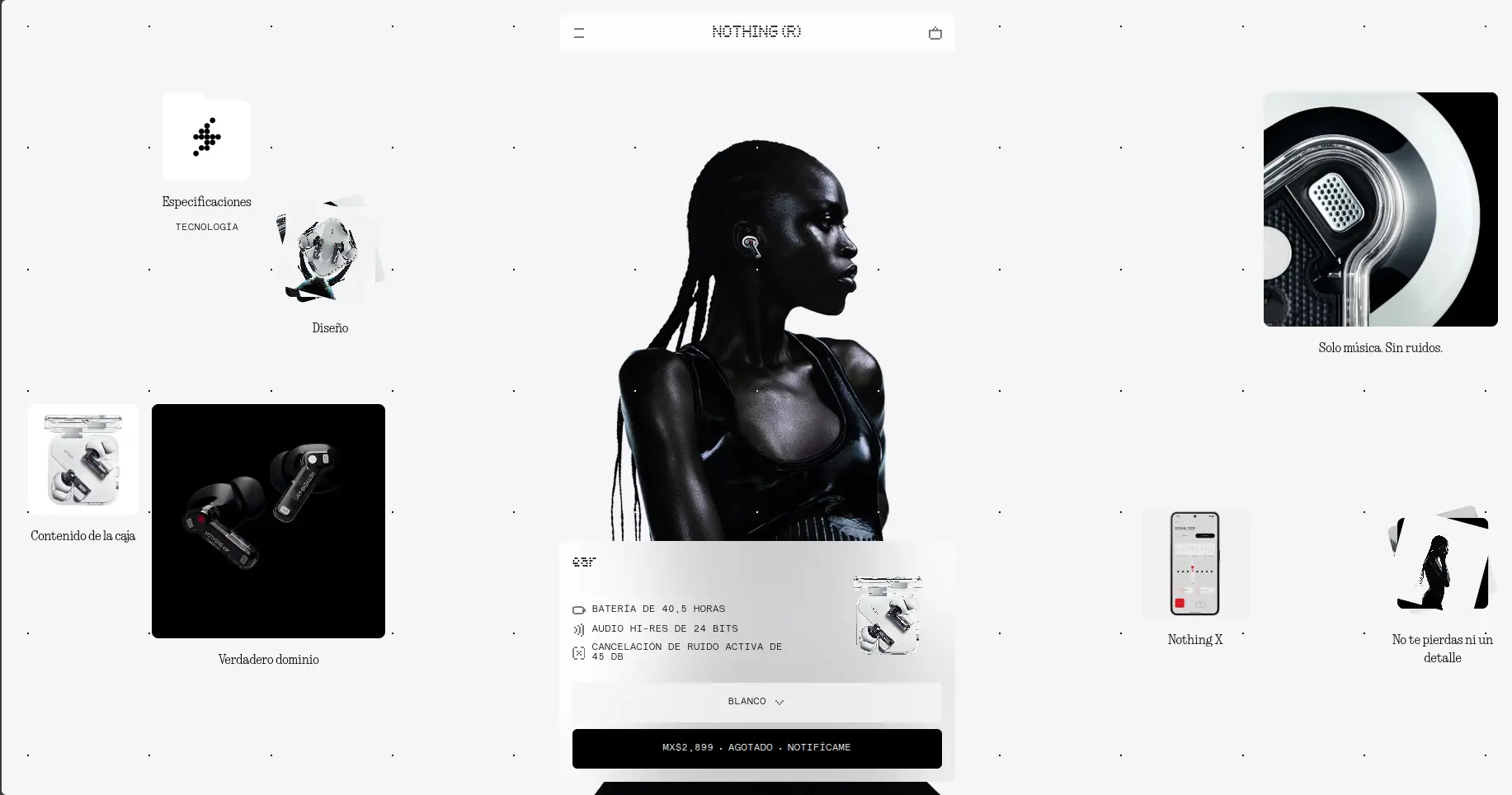
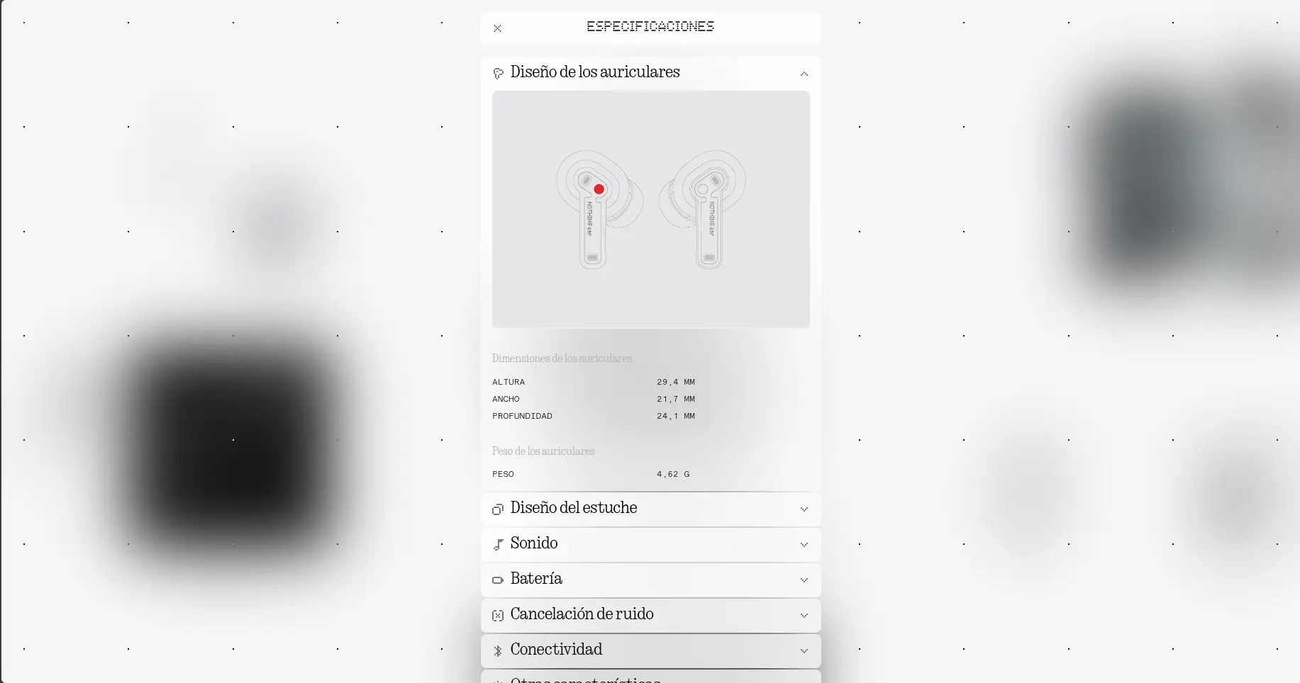
Nothing Ear page with cards for specs, design, and box contents arranged around the main photograph.Expandable spec panel showing the earbuds' dimensions, weight, sound, battery, and connectivity.
Slides and scroll down to see more product information.
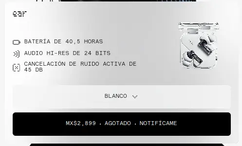
Floating purchase card with battery, audio, and noise cancellation specs, a color selector, and a price button.
Total price, add button, and product options all in plain sight.
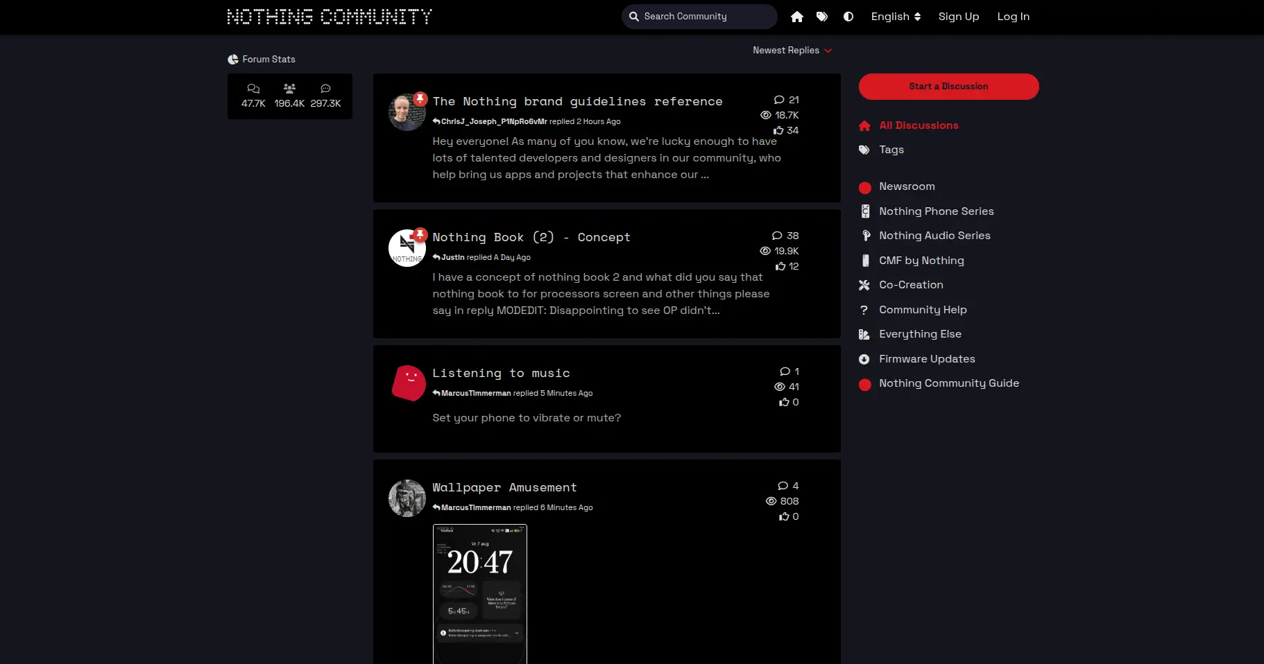
Nothing Community: a list of forum discussions with recent replies, view counts, and categories in the sidebar.
A page dedicated to the community, with live forums.

Poppi

drinkpoppi.com

Poppi home page mosaic: cans on saturated color backgrounds and, at the center, a video from the founder with an “our story” button.
A home page with a seasonal promo video. Scroll down and you find bold colors, interactive buttons, and videos that both highlight and complement the product.
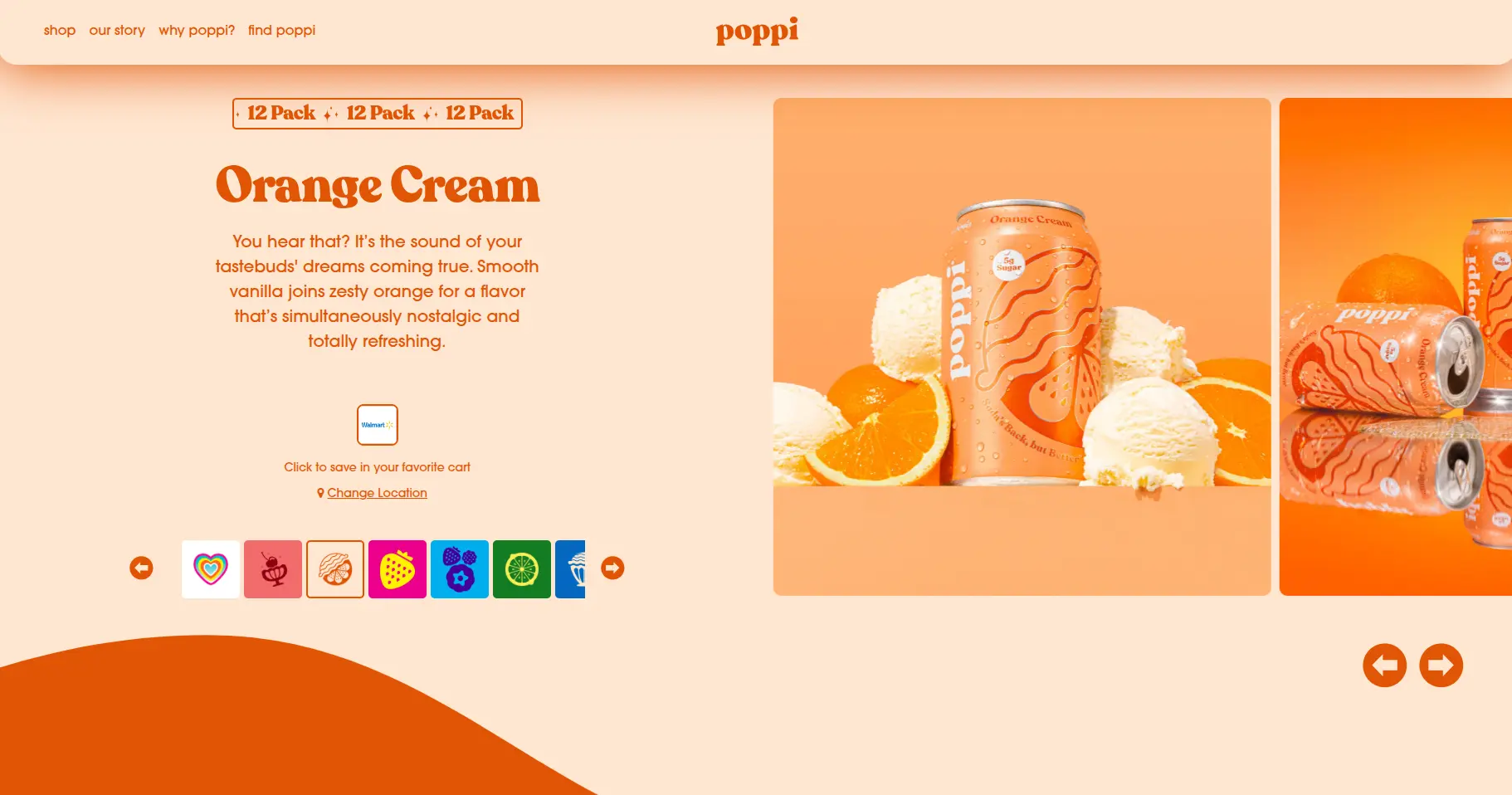
Orange Cream flavor page with a short description, a carousel of flavor icons, and a product gallery on the right.
Flavor and quantity options, paired with a gallery customized per flavor and videos.
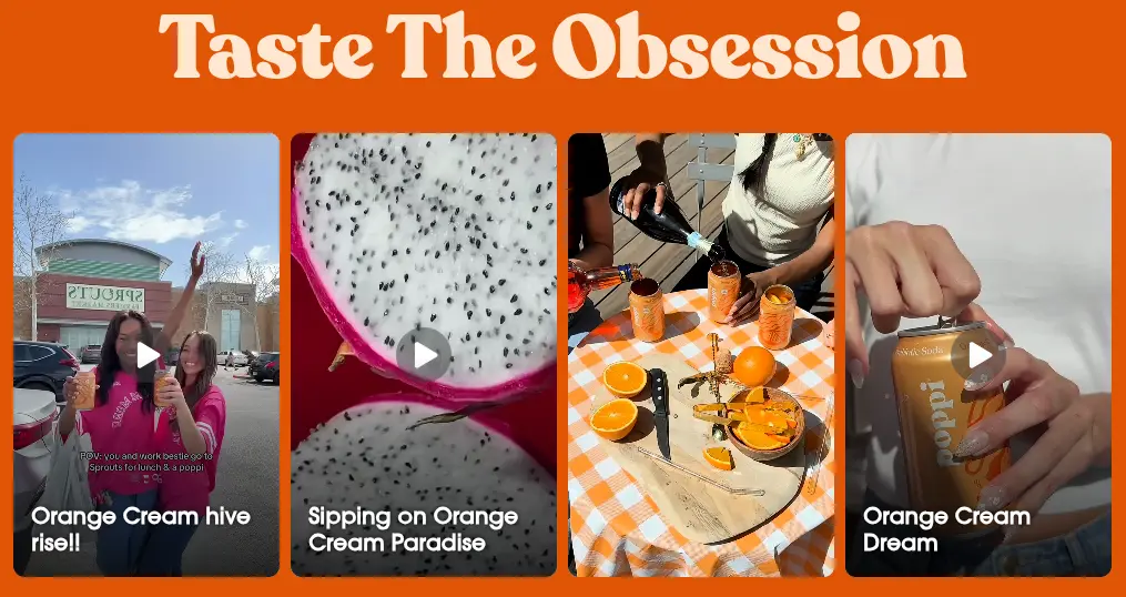
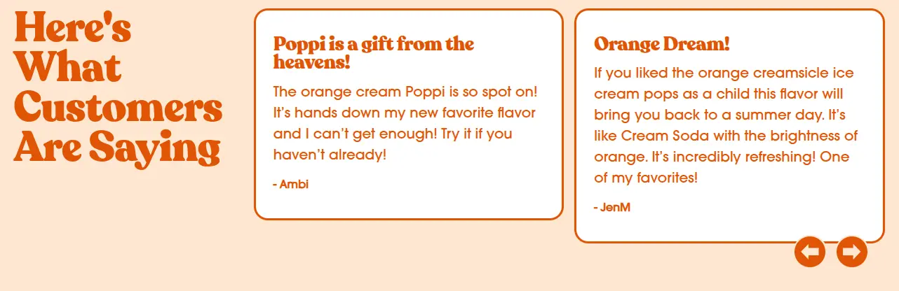
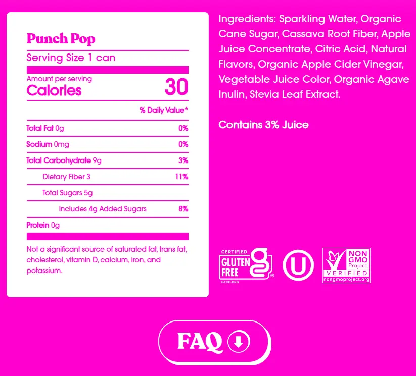
“Taste The Obsession” section with four vertical videos of real customers drinking Poppi.“Here's What Customers Are Saying” section with two signed testimonials inside cards.Nutrition table for the Punch Pop flavor next to the ingredient list, certification seals, and an FAQ button.
Catchy headlines, icons, and a nutrition table with the important facts kept simple.

Bershka

bershka.com

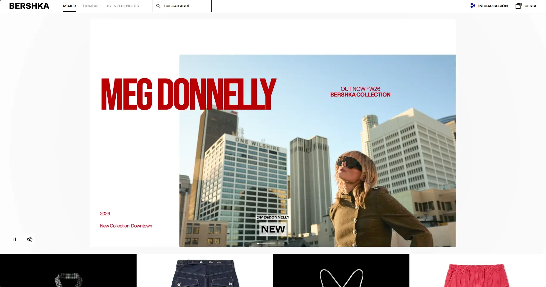
Bershka home page with a full-screen campaign video and a row of featured garments below it.
Videos, photo sliders on the home page, and photo inspo that genuinely grabs your attention.
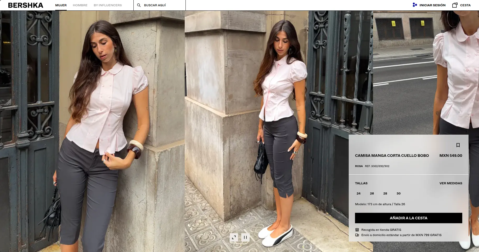
Bershka product page: three video shots of the same shirt with the price, size, and add-to-basket card on top.
Video slides of the garment while you pick your size and check the details.
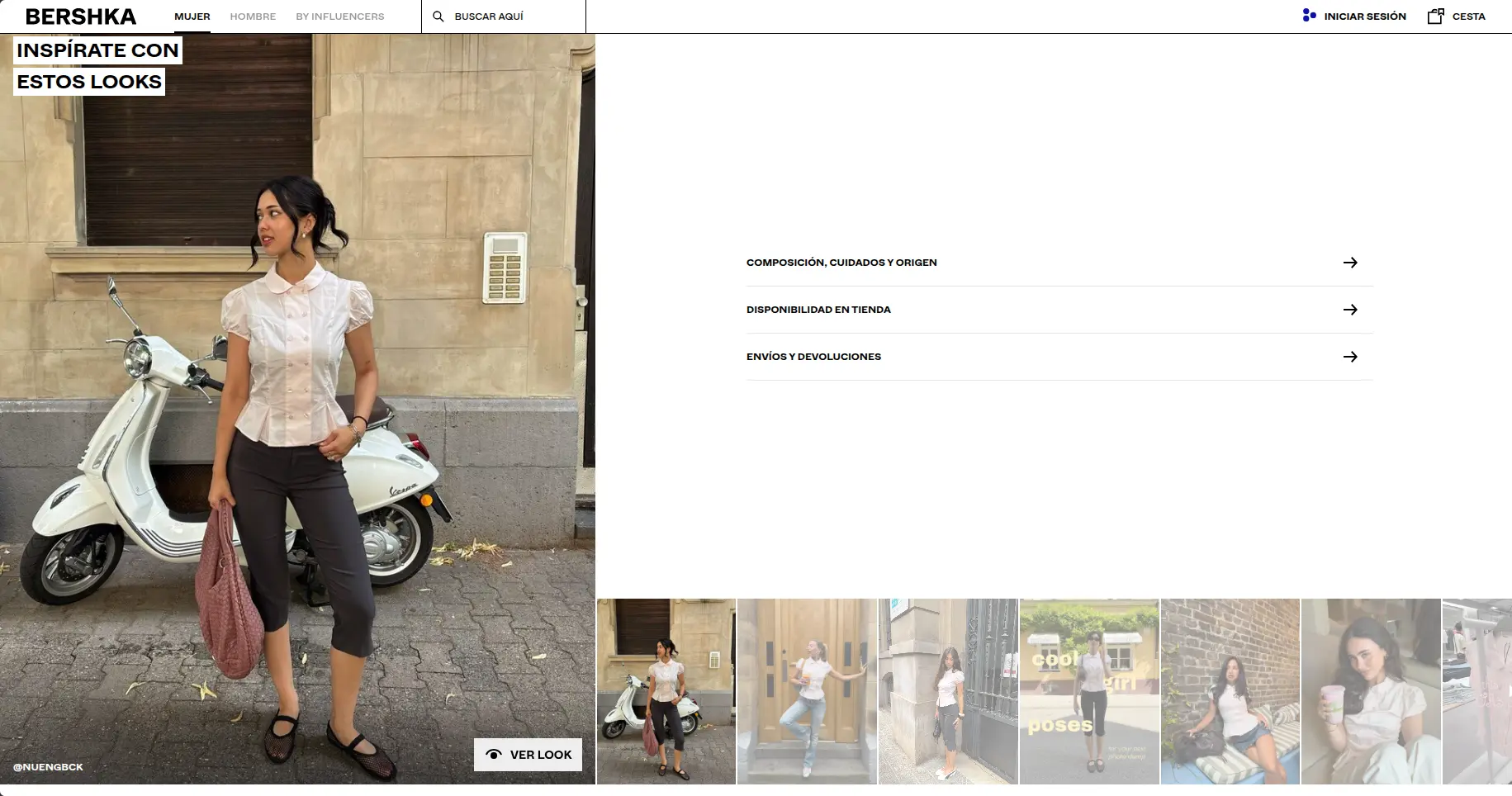
“Get inspired by these looks” block with the garment in a street photograph, accordions for composition and availability, and thumbnails of other creators wearing it.
Fabric and care details, in-store availability, videos of the product in the store, and the same piece styled by different influencers and models.

IKEA

ikea.com

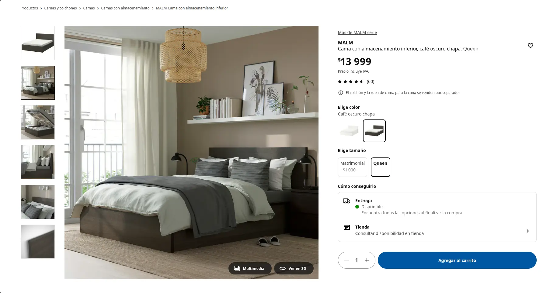
MALM bed page: thumbnail gallery, price, rating from 60 reviews, color and size selectors, and an add-to-cart button.
Product description and usage suggestions.
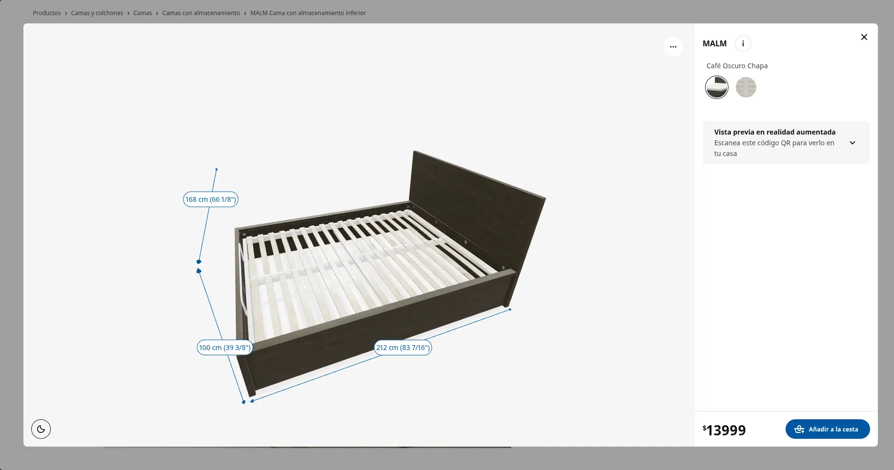
3D viewer of the MALM bed with its dimensions annotated, an augmented reality preview option, and the price with a buy button.
3D preview of the product.
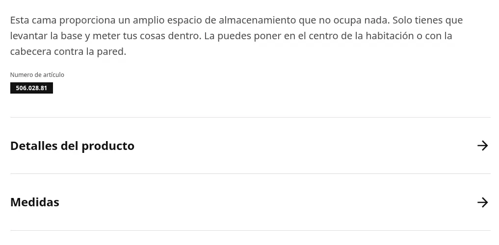
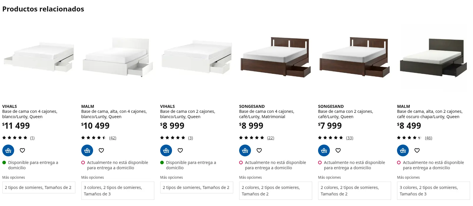
Short description of the bed with “Product details” and “Measurements” accordions.Row of related products with price, rating, availability, and direct cart and favorites buttons.
Summarized information and recommendations based on your search.
IKEA header with the search bar and a row of categories, each illustrated with a product photo.
Catalog imagery and a search bar on every tab.
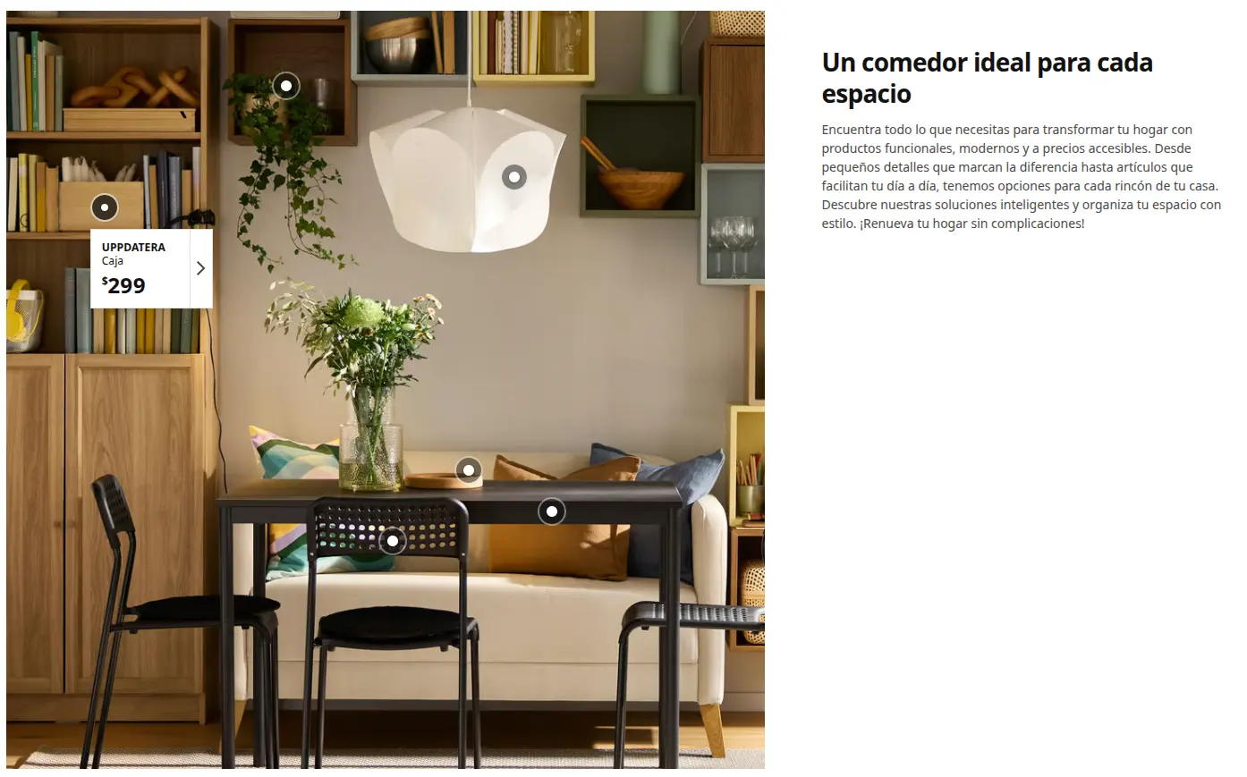
Dining room scene with interactive hotspots over each piece; one is open and shows the product name and price.
Inspiration sections with prices and direct access to cart and favorites.

What we like about these pages

They name things the way their customers already name them — no extravagant or technical terms — putting creativity first.

And that's a core part of e-commerce UX: if a shopper lands on the page for one specific product, the promotions show up in strategic spots — bright colors, different typography, or their own photo and promo page — so the shopper adds more products to the cart.

Four pages, four takeaways

From the four pages you just looked at, we can conclude that:

  • All of them use icons to accentuate information.
  • They show testimonials or ratings.
  • They use photos of real people using the product, or explanatory videos.
  • They make sure the add to cart shows up at the strategic moments.

Now that you're inspired and ready to start investing in your business's website, we can help you build the best e-commerce UX out there.

Start now.